Climates on a Rotating Earth
Required Reading:
Thomas et al. (2004) Nature 421: 145-148 Hotlink.
We can divide the study of
climate into a number of sub-areas. The first of these is the global pattern of
penetration and absorption of solar energy. That energy is the driving force
for most of what follows. It is, therefore, where we begin.
The solar energy flux which
reaches the outer limit of the atmosphere (and on a surface held perpendicular
to the sun's rays) is 2 calories/cm2/minute. That's called the solar
constant. It isn't really constant, however, since the orbit of the earth
around the sun is elliptical, so that the distance from the earth to the sun
varies seasonally. The so-called solar constant, therefore, varies by about 15%
from season to season. However, only about 1/2 the energy striking the outer
surface of the earth's atmosphere actually reaches ground level; the remainder is reflected, re-radiated, or absorbed
within the atmosphere. In addition the relative energies in the colour spectrum
which reaches the surface are much different than those which strike the upper
atmosphere. To give you an idea of where the energy goes:
21% is reflected by clouds back into space
5% is reflected by dusts and aerosols
6% is reflected by the earth's surface
3% is absorbed by clouds
15% is absorbed by dust, water vapour and CO2
The next question we ask is: Why are the tropics, i.e. the low latitudes, warmer than
the poles? To start with, the total number of daylight hours in a year is
constant for all points on earth; over the year every site averages 12 hours of
daylight and 12 hours of night per day over the entire year. The distribution
of daylight hours during the year differs dramatically, of course. But the
answer is still simple and obvious: the input of solar energy, measured in
calories, is not evenly distributed over latitude; the rate of input, and total
input, are both higher in the tropics. The real question is
why? Before considering the earth's surface and what happens there, you
should also note that the thickness of the atmosphere through which light must
penetrate to reach the surface differs with 'solar' latitude. At high
latitudes, where the surface is 'tilted away' from the sun, the effective
thickness of the atmosphere is greater, and therefore, all those absorptions
and reflections listed above are occurring to a greater extent, and less of the
input solar energy reaches the surface.
It isn't day length that's
important, but the intensity of sunlight, measured as calories per unit area.
The solution to the problem is simple trigonometry. Let's use as an example a
comparison of solar heating effects at the equator and at 45o N
latitude. Let's be precise, and say that we're making this comparison on the
date of one of the equinoxes, when the sun shines directly down on the equator.
Let's compare square sunbeams 1 cm on a side. Since the sun is much larger than
the earth, the solar constant applies to both beams as they arrive at the outer
atmosphere. Glossing over both differences in the thickness of the atmosphere
which must be penetrated to strike the earth's surface and the complexities of
spherical trigonometry, we'll temporarily assume the sunbeams strike flat
surfaces. At the equator the 1 square cm sunbeam is
absorbed by an earth surface which also measures 1 cm2. At 45o
N latitude the surface of the earth is at a tilt with respect to the beam. In
fact, at that latitude the angle of incidence of the beam (90 - L) and the
latitude are equal. To be completely accurate representation would require
spherical geometry. Without spherical trig, on our artificially ‘flat’ earth,
energy input is spread over an area 1 cm wide, but 1.414 (1 x sqrt(2))
cm long. Where 1 calorie per cm2 was available at the equator, even
disregarding atmospheric thickness and spherical trig only 0.707 calories/cm2
are available at 45o latitude. Since we live at about 42o
latitude, that is a fair approximation. The effect on temperature
of movement away from the solar equator averages out to about 1o
C/degree latitude. These approximations become more suspect as we move closer
to the poles, because the disregarded complexities become more significant.
Further, we have made our comparison at an equinox. How does this comparison
shift as seasons change?
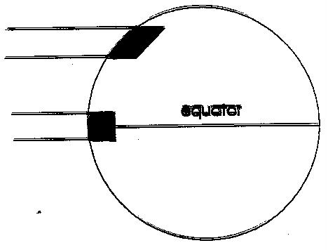
Figure
1 The areas of sunbeams of equal
size as they spread over the surface of the earth at differing latitudes. To be
completely accurate representation would require spherical geometry.
Day length at the solar equator
is 12 hours each day of the year. However, because the earth's axis is at a 23o
tilt with respect to the plane of the earth's orbit around the sun, the solar
equator moves seasonally, unlike the one we draw on maps. The solar equator
moves from the Tropic of Capricorn (approximately 23o S latitude) on
December 21 to the Tropic of Cancer (23o N) on June 21. The map equator
is the latitude at which the variance in day length is smallest. Meanwhile,
north of the Arctic Circle and south of the Antarctic Circle (each at
approximately 67o latitude) there are 'days' and 'nights' 24 hours
long. In fact, the circles mark the map latitude where the 'solar latitude'
reaches 90o on at least 1 day of the year. A fair part of seasonal
temperature variation is explained by considering seasonal patterns in solar
latitudes. Let's consider our summer period. On June 21 the solar equator is at
23oN. That makes our effective solar latitude not what the map says
(42o), but rather 42 - 23, or a little less than 20oN.
Thus, not only are our summer days longer, but it is as if we were temporarily living
at lower latitudes, at least with regard to the solar energy input per unit
area per unit time. Of course, the opposite applies during winter; our
effective solar latitude on December 21 is 42 + 23, or about 65oN,
and our days are shorter. Both the energy input per unit area per unit time and
the duration during which we receive that input are reduced.
As a last comment on energy inputs, atmospheric heating results from 2
energy inputs:
1. absorption of incoming radiation, which accounts for 18% of
incoming energy, and is unlikely to change much over geological time scales on
earth;
2. re-radiation of infra-red energy from the earth's surface,
and its absorption by CO2 in the atmosphere.
That absorption is what's
termed the 'greenhouse effect', and adds significantly to the heat load of the
atmosphere. We can change the pattern of re-radiation in two ways. 1) By
changing the albedo (reflectance) of the earth's surface (building asphalt
parking lots increases the amount of absorption and re-radiation as infra-red;
in winter a snow cover increases the albedo and decreases absorbance, cooling
the climate even more than decreased day length and increased solar latitude
might suggest alone). 2) By changing the chemical composition of the atmosphere.
Atmospheric CO2 has approximately doubled since the beginning of the
industrial age, i.e. from around 200 ppm in the 1700's to approximately 360 ppm
today, but much larger increases may follow if we unbalance the solubility
equilibrium of atmospheric and aquatic CO2 by continuing and
expanded combustion of fossil fuels. Current models for the increase in
greenhouse gases project a possible atmospheric CO2 concentration of
600 ppm by 2050 (this is an extreme estimate for this short time). A part of
the increase is due to increasing rates of fossil fuel combustion as the
developing world becomes more industrialized through the use of fossil fuels. A
part comes from anticipated increases in deforestation of tropical areas, and a
part comes from a shift in the equilibrium between the atmospheric and larger
oceanic CO2 pools. For purposes of our study of current climate and
geographical patterns in climate, the greenhouse effect is not important, but
the atmospheric heating resulting from absorption of solar energy and
re-radiation is. That atmospheric heating drives the global patterns of air
circulation. Global warming is a separate topic to be considered at the end of
this climate lecture.
To understand air circulation patterns
let's begin at the equator, and momentarily forget that the surface of the
earth is covered by irregular land masses as well as water, and that the earth
rotates on its axis. And let's again begin by considering the pattern at an
equinox, when the solar equator and the map equator coincide. For the moment,
consider the flow as if it were two-dimensional, just rising and falling on a
plane in the atmosphere. At the equator the intensity of solar energy input is
at its maximum, and the atmosphere is warmed most. What happens to hot air?
Think no further than a hot air balloon. Hot air rises. As the hot air rises it
expands in the more rarefied atmosphere of higher altitude (that's the reason
barometric pressure is compensated to sea level, and the difference used to
drive simple altimeters). To expand, any parcel of air must push neighbouring
parcels aside. To expand, the air does work, spends energy. That energy has to
come from the parcel's own energy supply. Spending it means the parcel cools.
That cooling occurs at a characteristic rate, called the adiabatic lapse rate.
We'll discuss adiabatic cooling more later. For now, we only need to know that
air heated at the earth's surface at the equator rises, and cools as it rises
and expands. The rising creates a low pressure area at the equator; it's
occurring continuously, thus forcing a flow in the upper atmosphere away from
the equator. The rising air is deflected towards increasing latitudes. The
combination of cooling caused by rising in the atmosphere and additional
cooling caused by displacement from the equator causes a gradual increase in
the density of the air mass we're following. If hot air rises, then cold air
sinks; it's just the result of changes in the densities of air masses as their
'temperature' changes. By the time the air mass has reached about 30o
latitude (N or S), its density is higher than that of the surface-warmed
atmosphere beneath, and the air mass sinks back to the surface. That produces a
band of consistently high pressure at what are termed the 'horse latitudes'.
The reverse of what happened when the air rose happens when it falls. The
parcel of air is compressed by parcels surrounding it, which are at higher
pressure at lower elevation; work is done upon the falling air; that energy
input warms the falling air at the adiabatic lapse rate. But the
descending air has to go somewhere, it can't just pile
up. A portion of the descending air is deflected toward the equator, and
completes a circulation cell. That air produces what we call 'trade-winds'
(about which more later).
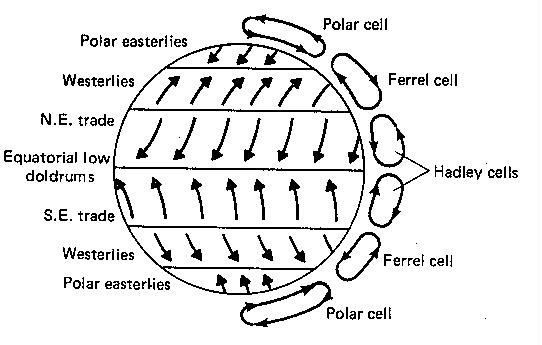
Figure
2 The positions of the Hadley
upper air circulation cells with respect to latitude. The other part of the descending
air is forced towards more extreme latitudes.
At a point in the general
neighbourhood of 45-50o latitude (exact position here is much
hazier) the warmer air from that equatorial circulation cell meets air masses
from a cold, polar circulation cell. The polar cell results from the descent of
very cold, dense air masses near the poles, and their spread to lower
latitudes. The poles are thus another zone of fairly steady high pressure. Where these two masses meet (equatorial air moving to higher latitude
and polar air to lower latitude), air 'piles up' at the surface, causing an
upward displacement. Because transient shifts in flow cause this zone to
move slightly in latitude, there is a zone here of unstable pressure. We live
about there, and, as you'll see, the unstable pressure leads this region to be
characterized by storms. We now have the basic N-S global circulation cells
mapped. We have disregarded, to this point, the effects of warming and cooling
on atmospheric moisture content and the effects of the earth's spin on the
direction of air movement (wind) at the surface of the earth.
The next step is to understand
the effects of atmospheric heating and cooling on relative humidity, and thus
on rainfall. As hot air rises at the equator, it cools according at the
adiabatic lapse rate. In saying that, we are assuming no further input of
energy (i.e. absorption of solar energy) as the air mass rises. Thus, what
follows is an approximation which disregards the slight energy input during
rise. The atmosphere decreases in pressure at a constant rate with altitude,
and thus the rate of cooling is constant with altitude. That rate of cooling,
called the adiabatic lapse rate, is
defined as: "the rate at which air cools as it
rises freely through the atmosphere." For dry air, that rate is 10oC/km.
We must specify dry air because water vapour has a higher thermal capacity than
the gases which compose dry air. In addition, warm air has a higher capacity
for water vapour than cool air; if a rising air mass cools sufficiently it may
become saturated. If it cools further, water vapour will condense to a liquid
state on particulate matter in the atmosphere. Should condensation occur, the
heat of vaporization of the condensing water vapour (approximately 585 cal/gm)
is released into the air mass, slowing the rate of cooling to 6oC/km.
Now consider the atmosphere. As
it cools, the transition in temperature is opposite that of relative humidity.
As air cools, it takes less and less water vapour to saturate it, i.e. it can
hold less in solution. Saturation is what the weatherman calls 100% relative
humidity. Relative humidity is a measure of how much water vapour is in
solution in comparison with a saturated solution. Thus the same amount of water
vapour that represents 50% relative humidity at 20oC inside your
house condenses on windows because that more than saturates the colder air
against the window. As the air mass rises at the equator, it reaches 100%
relative humidity, and further rise and cooling causes
water to condense out on particulates in the air (dust), forming clouds. As the
water droplets get bigger, they fall as rain.
Assuming you now understand
adiabatic cooling and warming as air masses rise and fall, we can now explain
the large scale global latitudinal 'bands' of high rainfall and deserts. In the
tropics, at very low latitudes (really with respect to the solar equator), say 5o on either side, there is a low pressure
zone where solar heating causes a rising flow of air. As this air rises and
cools adiabatically, water vapour r condenses. The result is almost daily
rainfall, usually in the evening when cooler surface temperatures and a lack of
direct solar heating aids in lowering the temperature of the rising air to the
condensation point. For the same reasons, a more than proportional share of our
local summer rainfall occurs as evening showers. Note that tropical rain
forests lie along the equator include the Amazon Basin in South America, the
Congo Basin in Zaire in Africa, and the rain forests of New Guinea and parts of
southeast Asia. Each land mass lying at equatorial latitude has a region of
tropical rain forest.
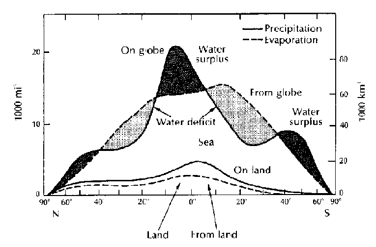
Figure
3 Latitudinal variation
in evaporation and precipitation for the earth as a whole.
Look now at the next latitudinal
zone whose weather pattern is clearly determined by the global latitudinal
pattern of air circulation, the zones surrounding 30oN and S
latitude. Here cold air masses are descending toward the surface and warming
adiabatically as they descend. As air warms, its relative humidity decreases.
Therefore, the air mass will only very rarely reach 100% relative humidity,
only rarely will condensation produce clouds, and rain is unlikely. Instead,
the warm air at the land surface will 'absorb' evaporation from the warm
surface into the unsaturated atmosphere (at least when it’s warm; these areas
tend to have the largest diurnal fluctuations in temperature on the globe). The
result is the world's great deserts, and a water deficit, i.e. there is less
precipitation than there is evaporation. In the southern hemisphere these are
the Atacama desert in Chile
(where more than 20 years once passed between measurable rainfalls), the Kalihari desert of southern Africa, and the Central Desert
of Australia. In the northern hemisphere they are the Gobi desert of Manchuria
(at high elevation this is a cold desert), the Sonoran desert of the
southwestern U.S. and Mexico, and the Sahara of Africa (in which there are also
areas with no recorded rainfall over periods of 20 years or more).
At both the northern and
southern latitudinal boundaries of the desert zones are fairly narrow zones in
which precipitation shows consistent patterns of seasonal variation. Along the
equatorial region is a zone which receives most of its precipitation in the
summer (i.e. becomes effectively equatorial), and little precipitation during
its winter period (i.e. becomes effectively desert in terms of solar latitude).
At the high latitude margins of desert regions, the pattern is exactly the
opposite. In these zones rain (or precipitation, whatever its form) falls
principally during the winter season when these regions are at a solar latitude
corresponding to the temperate, stormy latitudes; during the summer their solar
latitudes produce a moderate, desert-like climate.
At somewhat more extreme
latitudes, where warm equatorial and cold polar air masses meet, exists a zone of unstable low pressure. The meeting of the
air masses causes a general rising flow, and adiabatic cooling during the rise
leads to rainfall, but this is a diffuse belt, and rainfall is not predictable
at any specific location or time. The weather pattern is inconsistent and
stormy. Southern England lays in this latitudinal zone and so does the latitude
dividing the Canadian plains and the upper Midwest of the U.S. A look at winter weather patterns on the news
indicates the frequency with which precipitation patterns move along or close
to the U.S.-Canadian border. Remember that this zone does shift somewhat
seasonally. During the northern winter this zone reaches down to about 40o
N, while during the summer it is shifted northwards to about 60oN
(map latitudes). Also, note from the diagram that during the winter our
latitudes are more under the influence of polar air moving south (at least at
the surface), while during summer the pattern of influence is reversed and
surface flows up to about 60o N are more influenced by warm
equatorial air moving northward. Even though the predominant influence may
shift, the instability leads this zone to receive precipitation in all seasons.
Finally, at extreme latitudes we
find Arctic and Antarctic polar deserts. These areas receive extremely low
amounts of precipitation annually; they are zones of stable high pressure where
cold air descends back toward the surface, and where rainfall (or snowfall) is
therefore unlikely. While we think of them as icy wastelands, the ice has built
up over extremely long periods, and little is added in any year. They are truly
deserts according to global circulation patterns and their influence over
precipitation. These areas cover latitudinal zones from around the polar
circles (65o or so) to the poles.
There are other air movements of
great importance in our weather. Surface winds, produced directly or indirectly
by the daily rotation of the earth on its axis, will be considered later. For now
we will assume that surface winds exist. As surface winds pass over terrestrial
topography, the air masses comprising them necessarily must rise and fall.
Those upward and downward movements subject air masses to the same adiabatic
changes in temperature, and therefore are also of great importance in
determining precipitation patterns. As a result, on the leeward side of every
mountain chain there is a 'rain shadow',
a region of low rainfall; and on the windward side, particularly along mountain
slopes, there is typically a fairly 'wet' climate and biological community.
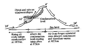
Figure
4 The effect of adiabatic lapse
on the pattern of rainfall and temperature across a mountain range.
The classic diagram to examine
this phenomenon is an examination of the passage of air over the Cascade and
Rocky Mountains of western North America. The Rockies reach slightly more than 2
km in peak elevation, and the Cascades do not quite reach those elevations, but
that's a fairly good estimate of the rise over surrounding terrain. Assume
(correctly) that a westerly air flow occurs (winds are properly described using
the direction from which they come, so that a westerly wind is one moving west
-> east). For numerical simplicity we'll follow an air mass which begins at
the western edge of the rise at a comfortable 20oC, and a moderately
high relative humidity. As the air rises up the western slope, it cools
adiabatically, initially as unsaturated air at the 'dry' adiabatic lapse rate
of 10oC per km. Again for simplicity assume that the air reaches
saturation (100% relative humidity, the condensation point) at 10oC.
Then, when the air has risen halfway up the mountain(s), or at an elevation of
1 km, it is saturated, and, as it continues to rise and cool from 1 to 2 km
elevation, clouds will form and rain will fall. You now know why mountain peaks
are so frequently bathed in clouds. Of greater importance is the difference in
rate of cooling in the 1-2 km zone. Here condensation releases the heat of
vaporization, so that this rising air cools at the lower, saturated adiabatic
rate of 6oC/km. Therefore, air which had cooled to 10o at
1 km cools to 4o at the peak of the mountain. Now that air begins to
fall, warming adiabatically as it descends. As it warms, the relative humidity
drops. Since the air is now unsaturated, the rate of warming is the 10o
unsaturated rate. When this air has descended to 1 km, its temperature is 14oC,
and at the eastern base of the mountains it is 24oC. The leeward
side is warmer, and since the air is unsaturated, rainfall is an uncommon
occurrence. The leeward areas of the Rockies are the dry plains of Colorado,
the Great Basin of the U.S., the Great Plains, and the Canadian prairies; it is
the rain shadow of the Rockies which explains their dry climates. Similarly,
the steppes of central Russia are the rain shadow of the Ural Mountains.
The rain
shadow phenomenon and the adiabatic temperature changes which promote or make
rainfall unlikely, are important in many areas of the world (including oceanic
islands). However, there are complications traceable to the more
complicated surface circulation patterns of air and water resulting from the
earth's spin and the location of major land masses. For now we can suggest that
the effects of rain shadows and differences in thermal capacity of saturated
and unsaturated air broadly explain the general climatic pattern described as
'continental'. Regions in the middle of continents typically undergo seasonal
extremes in climate – hot summers and cold winters. There are 2 parts to a more
complete explanation of the extreme seasonal fluctuations at mid-continent:
1. Water has a
high thermal capacity. The presence of large bodies of water nearby (e.g.
oceans, the Great Lakes) tends to moderate temperature fluctuations. The
temperatures of these water masses change very slowly, and air passing over
such bodies of water tends to reach temperature equilibrium with them, as well
as becoming saturated (reaching 100% relative humidity at the equilibrated air
temperature). Thus, temperature extremes are surprisingly moderate at
Anchorage, Alaska.
2. Temperatures
can fluctuate more rapidly and to wider extremes when air is 'dry' (i.e.
unsaturated) than when air is at or very near saturation. That is evident in
the adiabatic lapse rates. Continental topography virtually assures that areas
in the centers of continents are on the leeward side of some significant
topographic feature, thus air will likely be unsaturated. The effect can be
extreme: Our mean monthly temperatures differ by about 25oC between
warmest and coldest months. In central Eurasia (the world's largest landmass,
with no central Great Lakes) the parallel difference in monthly means exceeds
55oC.
Climatologists use a complex
measure called 'continentality' to
indicate the combination of variation in temperature and humidity which
demonstrates the difference between a 'continental' and a 'marine' climate.
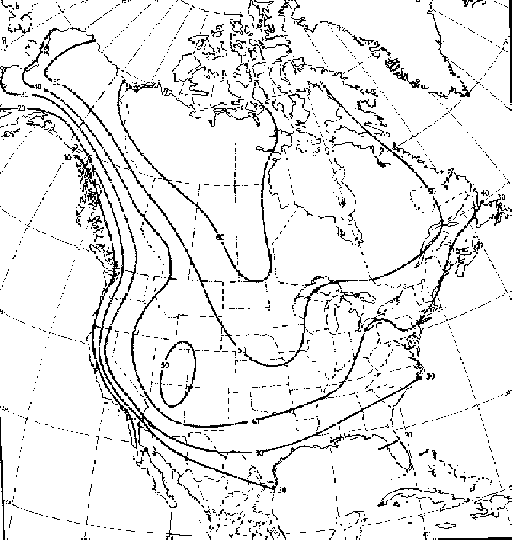
This measure also corrects for an expected latitudinal increase in temperature
variation. It produces an interesting map for North America. Values are highest
in mid-continental arctic areas, i.e. the Northwest Territories and prairie provinces, and nearly as high on the U.S. Great Plains and prairies. Values are lowest all along the
Pacific coast, and considerably lower along the Pacific coast than at parallel
latitudes along the Atlantic. The reason is the prevailing westerly winds in
our latitudes, so that the effects of marine influence are felt most strongly
along the west coast. Much of the weather along the east coast arises from the
movement of air across the entire continent until reached its eastern margin or
by northward movement along the coast. Finally, note the 'bump' in the
isoclines for continentality, pushing significantly northward (i.e. less
continental climates) in the region of the Great Lakes.
Figure
5 The pattern of
a 'continentality' over North America. Lines on the map are isoclines of
constant continentality. Note the dip to lower latitudes in the mid-region of
the continent.
The last major factor needed to
understand large scale, global patterns in climate is the daily rotation of the
earth on its axis, and concomitant effects on air and water circulation.
Rotation produces what is called the Coriolis
effect (or Coriolis force). Basically, the
Coriolis force represents conservation of momentum for objects moving over the
surface of a rotating earth. Its effect causes air masses moving latitudinally
to deflect from the simple N-S patterns indicated in considering global air
circulation previously. To understand the Coriolis effect
its easiest to think of yourself as standing at the equator. At the equator the
earth is approximately 40,000 km in circumference. Standing
quite still for 24 hours at the equator, the rotation of the earth over that 24
hours will have caused you to move 40,000 km. The air which surrounds
you moves at the same 40,000 km per day, assuming you feel no wind.
Figure
6 The pattern of surface air circulation
driven by the earth's rotation.
We already know that equatorial
air is heated by solar energy, rises, expands, and is forced aside to higher
latitudes by more rising air behind it, and that this air spreads to 30o
latitude before it has cooled sufficiently to descend back to the surface. This
air has both mass and momentum. What happens when it moves away from the
equator? What is the circumference of the earth at 30o latitude? A
little trigonometry produces the result; the circumference is about 34,600 km
at 30o. Thus, if you'd been standing at 30o instead of
the equator, you would have been moving 34,600 km per day due to the rotation
of the earth. Equatorial air descending at 30o is moving faster than
that, even including friction, which would decrease its actual velocity as the
air spread northward and southward to less than the ~40000 km per day it was
moving as it began to rise. Rotation of the earth is from west to east (that's
why the sun rises in the east and sets in the west, in case you've lost track).
Therefore, that's the direction of deflection of winds at 30o (i.e.
from west to east, or westerly), or at the latitude of descent of air moving
toward higher latitude from the equator. Frictional drag as air spreads from
the solar equator is important. Otherwise the difference in velocity (167.7
km/hr) would produce continuous hurricane force winds. Even though the velocity
is far less, the Coriolis force deflection is a major cause of surface wind
patterns.
The westerly deflection (west
east) continues in that portion of the descending air which moves toward more
extreme latitudes. In the southern hemisphere, with few land masses to block or
slow these winds, this deflection produces the 'roaring 40's'. Those strong
winds made sailing westward (east west) around South America through the
Straits of Magellan difficult for everyone from early explorers attempting to
circumnavigate the globe to Darwin's voyage on the Beagle. In the northern
hemisphere this deflection is somewhat less evident due to the blocking effect
of the many large land masses. Is there any local evidence of Coriolis effect? Water currents circulate demonstrating the Coriolis
force (see below). The same forces produce cyclonic storms.
Let's return now to global wind
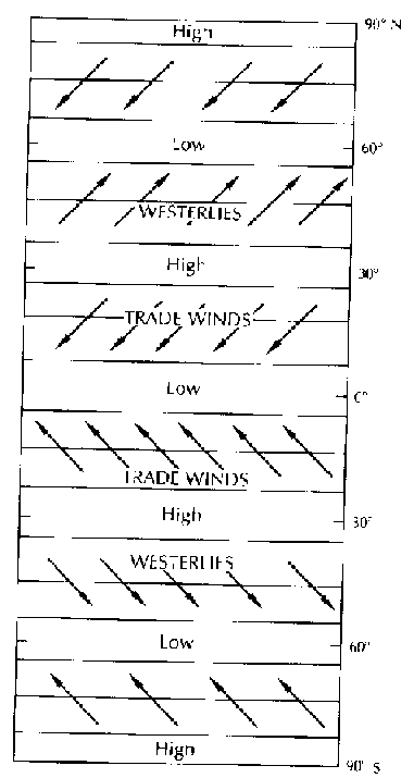
patterns determined by Coriolis forces. Remember we started by looking at poleward flows arising from the equatorial (Hadley)
circulation cell. The air flow which descends at 30o then moves back
toward the equator is affected differently. Frictional drag near the surface
(in fact almost entirely in the 1 km nearest the surface) has slowed this air
mass to within a few km per hour of the rotational velocity at 30o,
i.e. the velocity differential or wind speed is only a few km/hr. As this air
moves toward the equator, it now has a horizontal velocity which is lower than
the rotational velocity of the earth's surface over which it is passing.
Frictional drag tends to accelerate this air, but it is nevertheless deflected
from east to west. These northeasterly winds (north -> south as a result of
Hadley cell circulation, east -> west from Coriolis deflection) are called
the trade winds, or NE trades, in the northern hemisphere, and accordingly, SE
trades in the southern hemisphere. Near the equator frictional drag has caused
surface winds to essentially catch up with surface
velocity, and there is little N-S velocity; air movements are dominated by the
Hadley cell vertical circulation. As a result surface winds are usually weak
near the equator, and result in a zone known as the doldrums.
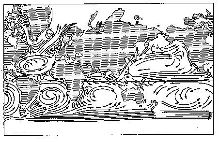
Ocean currents are also directed
by Coriolis forces. Generally the direction of ocean currents is determined by
the effects of surface winds moving surface waters, and the effects of land
masses and Coriolis forces deflecting that water movement. Note that, like the
winds, ocean currents in the northern and southern hemispheres are basically
mirror images of each other. In the northern hemisphere currents generally have
a clockwise flow, and in the southern hemisphere flows are counterclockwise.
Figure
7 Water circulation in the world's
oceans: driven by the positions of the continents, the rotation of the earth,
and surface air circulation.
We should not neglect the flows
which accompany and return these major currents, for they too have important
effects. Where Coriolis forces draw surface waters away from continental
margins, that water must be replaced. The replacement water is cold,
nutrient-rich upwelling. These waters are the world's great fishing grounds.
Off Newfoundland, where the Gulf Stream is deflected towards Europe by its
northward movement, lays the Grand Banks. Off California and northern Mexico
where the Japan Current in its return flow is deflected westward across the
Pacific by southward movement, and off Peru, where a southern Pacific cell has
a return flow deflection, are similar, important fishing grounds. These
upwellings and coastal flows also have a major impact on the rainfall patterns
over nearby continental areas.
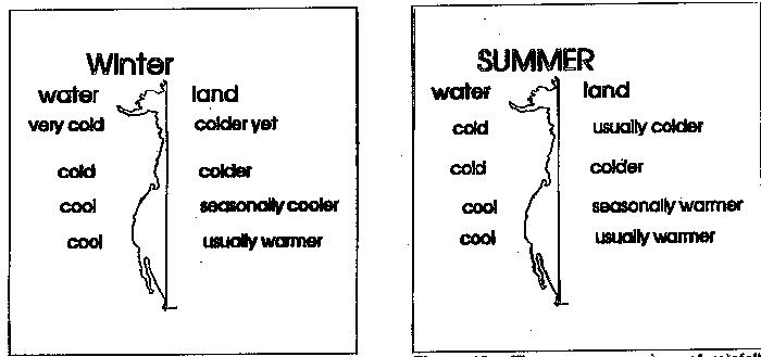
Figure
8 - Patterns of rainfall along the west coast of North America in
winter, indicating effects of the relative temperature of water and land.
In the Great Lakes region, some
areas experience what is often called lake-effect precipitation. The Great
Lakes represent a huge thermal mass which cools much more slowly than land
during winter. In fact, the lower lakes generally don't freeze over during
winter, meaning their surface temperatures are equal to or greater than 0oC;
they are thus clearly warmer than the land surface during much of the winter.
Winds passing over the lakes are equilibrated to the water temperature, and
saturated at that temperature. When this saturated air is cooled by coming over
land, precipitation in the form of snow is deposited. The air has thermal mass,
and does not cool instantaneously. Therefore the snow belts are typically at
least 20-30 km from shoreline. This explains the snowbelts
between Chatham and London and beyond (at the appropriate distance from Lake
Huron and with respect to the typical northwesterly
winds of winter). For Lake Erie this snow belt is south and east of the center
of Buffalo, for Lake Ontario it's south of Syracuse, N.Y., for Lake Michigan
(oriented N-S) it's a long band along western Michigan and Indiana, and for
Superior it's the skiing areas of the northern Peninsula of Michigan.
One of the grave concerns facing humanity is our effect on climates
around the world, due largely to our combustion of fossil fuels. Scientists
project increase in the global average temperature of ~2ºC, but important
differences across latitude and the spread of individual continents. Why do
they project increased temperature? Is there historical evidence that leads to
these projections? How do projections differ among latitudinal zones? We will
try to answer those questions, at least in broad terms. If the projections are
accurate, the effects on species diversity, the patterns of species'
distributions, agricultural production, and even sea level will by vast.
1. The Historical Evidence - we
know that there has been variation in the atmospheric concentration of CO2
over the last few hundred thousand years. The quantitative evidence comes from air
trapped in the ice of Greenland and the Antarctic. Cooperative studies of a
very long ice core (2,000 m), representing the last 160,000 years, from a
Soviet station at Vostok (78º S) (Lorius
et al. 1985) have shown a relationship between global climate and carbon
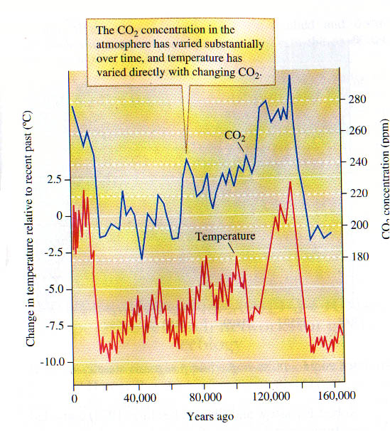
dioxide levels. Around 150,000 years ago
the CO2 level increased fairly dramatically from about 200 ppm to
around 280 ppm. It then dropped more or less gradually back to about 200 ppm by
around 20,000 years ago, and rose rapidly back to 280 ppm thereafter. The rapid
rises are associated with deglaciation. Thus, the rises are also associated
with periods of rapid temperature increase.
see Figure
9.
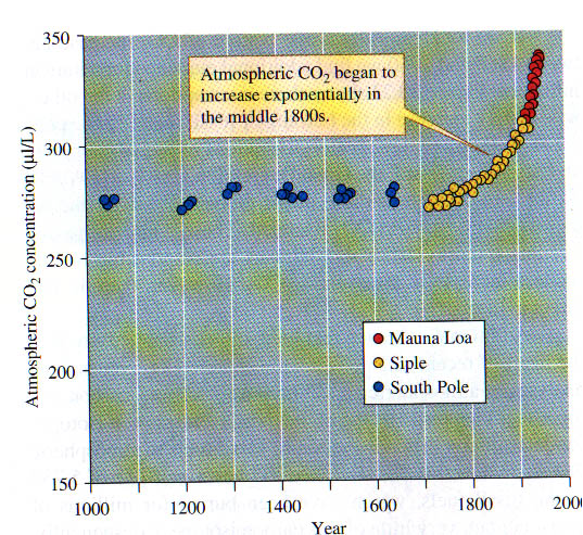
The Vostok ice core does not provide evidence
for the last 2000 years, since the core was too cracked and fragmented over the
last few hundred meters. The estimates
for the last 2000 years use a variety of source information. In part, some of
the data from the top of the Vostok ice core was
used; palynology provides some information, and data
from other ice cores was also used. The assembly of information was compiled by
Post (1990). In sum, the data suggest a relatively constant atmospheric CO2
concentration from 2000 years ago until the middle of the 18th century. Since
then the concentration has been increasing exponentially.
see Figure
10.
By 1953 the concentration had reached 315 ppm. The level is now 350-360
ppm. The most recent measurements have been made on Mount Mauna Loa in Hawaii,
and date back far enough to show an almost perfect correspondence with other
sources of data.
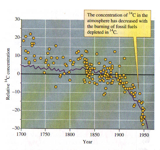
We are convinced that human activity
has caused the recent increase in carbon dioxide in the atmosphere. Why are we
so convinced? There are two sources of evidence:
1) The exponential
increase over the last 150 years has three "breaks". Those breaks
match with the First and Second World Wars and the Great Depression. They are
the three breaks in global economic activity. That is only indirect evidence.
2) Isotopic ratios between C12 and C14 indicate fossil
fuel combustion is the source of increasing CO2 concentration. The
half life of the radioactive isotope is 5,730 years. Fossil fuels were formed
millions of years ago. C14 in them will have decayed. If increasing
carbon dioxide in the atmosphere is due to fossil fuel combustion, then the
isotopic ratio should have changed over time due to the release of carbon with
an enormously reduced C14 content. The reduced ratio is called the Suess effect. It is clearly evident in Figure
11.
2. How do effects vary across latitudes? The
general pattern is that the temperature increase will be greatest at high
latitudes, in polar environments, and the change will be much smaller in the
tropics. However, the details of atmospheric and water circulation affect the
results of models attempting to predict change. Even the depth of the ocean,
and the depth to which surface circulation of warmer waters descends, affects results.
GCM (global circulation models) can only be calculated on supercomputers. One
such model, which seems to predict somewhat larger temperature change globally
than most, was developed by AES Canada. In arctic extremes this model predicts
2-4ºC warming. In isolated pockets of North America and Asia greater increases
of 6-8ºC are predicted. These are generally dry areas, and subject to greater
increase due to the lower thermal energy capacity of dry air. The key to seeing
the concerns about polar environments comes from looking at the predicted
change in Antarctic regions, where changes as large as 10-14ºC may occur during
the winters. The same thermal capacity arguments explain why larger changes are
predicted over land than over the oceans, independent of latitude.
Finally, what are the
predicted biological impacts of the changes associated with global warming, and
are some of these changes already apparent? Hughes (2000) argued that changes
are evident, and presented some of the patterns evident and expected from
global warming.
Why are these changes
important? Where local populations decline as a result of average poleward range expansion, open space is left that is likely
to be invaded (at least first) by weedy species. Changes in physiology and the
timing of life cycle events may lead to decoupling of important interactions.
For example, many plants, whenever they initiate seasonal growth, are cued to
flowering by day length. Associated insect pollinators are generally cued by
accumulated thermal energy degree-days). Global warming does not affect day
length, but does change the rate of energy accumulation. As a result of global
warming key pollinators may emerge before their required food resources
(pollen, nectar) are available, and die of starvation without pollinating the
plants. Decoupling of mutualistic, competitive, and
predatory interactions can clearly lead to extinctions, either at the local or
global level.
1) Mammals on Mountaintops
(and associated communities)
Predicted climate change should
have specific implications for particular species and communities. We will
consider biodiversity loss in a more general context later, but one of the more
neatly worked out predictions is for loss in diversity of boreal small mammals
from montane forests of the isolated mountain ranges in the Great Basin of the
western U.S. (Brown 1995, 1998). Using a prediction of approximate carbon
dioxide doubling from pre-industrial levels by near the end of this century,
and a 3ºC warming as a result, the distribution of montane forest was
predicted.
Figure
12 : the current and predicted forest
community. In the diagram desert shrubland is unshaded, piñion-juniper
forest is gray, and mixed coniferous boreal woodland
is dark.
It is not that boreal woodland will necessarily disappear on all mountain
ranges, but that it will move up the mountain by 500m, and that significantly
decreases the habitat area available to the small mammals. Using species-area
relationships for these species that Brown had determined earlier, he was able
to predict species losses on each range.
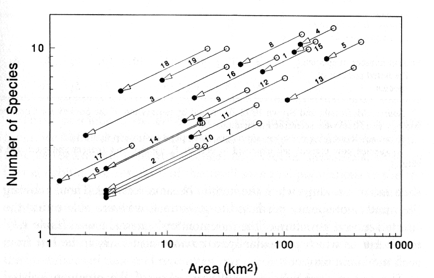
Figure
13 shows predicted changes. The open
circle is the current condition, arrows point down in parallel, at the slope of
the species-area curve for these small mammals, to a solid circle that
indicates the predicted number of species remaining after habitat loss.
However, Brown was able to go even further.
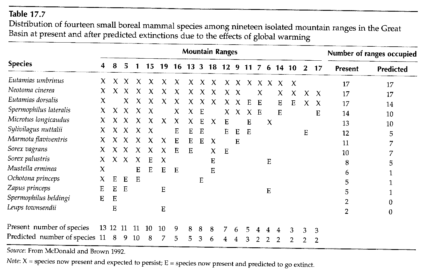
Figure
14 shows a table for boreal mammals,
ordered from the one present on the largest number of mountain ranges to the
rarest. He could then predict which species would go extinct on particular
ranges, or even globally extinct in the Great Basin. E in the table indicates
local extinction. The rarest three species are likely to go globally extinct,
and two others will become dangerously rare, persisting on only a single range
(note that there is an error in the last column of the table). Only two species
are predicted to remain present on all ranges where they currently occur.
2) Range shifts in
temperate, deciduous trees of the Great Lakes region
There are predictions for individual species in Brown's table, but these
are 'unique' small mammals isolated on mountaintops. What changes are predicted
for the distributions of species that are not so isolated? The means here are
"climate spaces" for the species. Climate space is the range of
climate conditions (usually single surrogate variables to represent them)
tolerated by the species. For example, Zapinski and
Davis (1989, described in Brown 1998) determined that a number of Great Lakes
area tree species had northern limits corresponding to the -15ºC January
isotherm. They also used the last post-glacial period to estimate the rate at
which tree species could migrate, using an artificially high estimate of 100
km/century. For each of the four species shown the current distribution is on
the left, and the predicted distribution for the end of this century on the right.The gray area above the
predicted distribution indicates the long-term potential distribution given
sufficient time for dispersal into new areas. That will take far longer than
the next century. Note the compression of each distribution from its current
southern limits.
3) Range shifts in
European butterflies and Monarch Butterflies
Another specific example of evident
effects of global warming on a taxon (i.e. a group of related species, rather
than just a single species or genus) is Parmesan et al’s study of range effects on butterflies
of Europe (Parmesan, et al. 1999). Her group studied changes in the ranges of
non-migratory butterfly species over the last century. Each species had the
northern limit of its range in northern Europe, and the southern limit in
southern Europe or northern Africa. Limitations in available data forced them
to perform three separate analyses: 1) changes in the northern limits of
species for all species with sufficient data to evaluate changes in northern
limits (which could, of course, be a northward or a southward movement), 2) a
parallel analysis for southern limits for those species with sufficient data to
evaluate that limit (and not all the same species as for northern limits), and,
finally, evaluation of changes in both limits where data permitted.
Northern boundaries have
moved northward in 65% of 52 species evaluated, remained stable in 34%, and
moved southward in one species (2%). This is a highly significant result (P
<< 0.001). Southern boundaries have retracted northwards in 22% of 40
species that could be evaluated, remained stable for most (72%) and moved
southward for two species (5%). This is not a significant northward movement.
Changes in northern and southern boundaries could be evaluated together for 35
species. Of these, 63% shifted northwards, 29% were stable at both boundaries,
6% shifted southwards, and 3% extended range both northward and southward.
This, again, is a highly significant result. The distance these species moved
northward ranged from 35-240 km. This is a far larger distance than expected in
a single new colonization event; in fact it is 5-50x expected dispersal
distances for these species. Thus, it appears that these range changes
represent slow movement by new colonizations, population growth at the site of
colonization, then a further dispersal founding yet another new population.
How closely do these
movements correlate with climatic changes in Europe during the last century?
Climate records show that annual mean temperatures have warmed by about 0.8
degrees C during the 20th century. Temperature isotherms have, as a
result, moved northward by an average of 120 km in Europe. That is also
approximately the average northward movement of range limits. Does this mean
that species can adapt to climate change? Yes and no. When climate changes
slowly enough, many species can keep up. However, the projected change in
temperature during the 21st century is far larger, estimated as 2.1
– 4.6°C. Can butterflies
(or other species with limited dispersal capabilities) keep up with changes of
that magnitude? Sadly, we’re likely to find out soon.
Monarch butterflies (Danaus plexippus) are one of the
fascinating characteristics of southern Ontario’s biota. Monarch’s make their annual spring and autumn
migrations across Lake Erie, filling trees where they stopover in Point Pelee
National Park. During autumn, the butterflies
fly to southern locations, including a major sites in the mountains of central
Mexico. They spend the winter in the fir
(Abies religiosa) trees in
high-altitude montane ‘islands’ (the fir stands occupy <0.5% of Mexico’s
area) for approximately 135 days (Oberhauser and Peterson 2003). The butterfly
overwintering period occurs during the dry season, with very rare snow/freezing
conditions. A combination of colder and/or wetter conditions can prove lethal
to the overwintering butterflies (less flying, greater exposure to
predators). Fully 70-80% of the two
largest populations died during a cold, wet period during 2002. With knowledge of the butterfly’s
sensitivity to temperature conditions and precipitation, Oberhauser and
Peterson (2003) modeled the likely outcome of climate change on butterfly
habitat suitability. They found that the
butterfly is likely to encounter inadequate conditions across its entire
Mexican range if Hadley Centre climate model forecasts are realized, mainly due
to enhanced exposure to cool-weather precipitation. If so, we could lose Canadian populations of
butterflies even of we were to protect their habitat and food source (milkweed)
in Canada.
4) Thermal stress in Intertidal Marine Species
Most investigators of coastal
marine ecosystems have assumed that climate change (warming) will adversely
affect intertidal communities at southern latitudes more than at higher
ones. However, a paper by Helmuth et al. (2002) suggests that the exact opposite will
occur. Species like mussels that live in
intertidal areas must be able to withstand aerial
exposure (emersion from water) during low tides, placing these organisms in
thermal stress. These investigators
examined the intertidal mussel Mytilus californianus along a latitudinal
gradient across the western USA from California to Washington state. Their study
showed that midday exposure of mussels to high temperature will
be greater at higher latitudes than at lower ones, in part because variation in
tide height will be more pronounced at the higher latitudes. Thus, for the next few years, the northern
sites will experience maximum midday exposure for intertidal
mussels, while those in southern California will have minimum exposure. Moreover, areas that sustain higher water
temperatures may also experience higher feeding rates by predators (sea stars)
whose metabolic activity is positively linked to water temperature. Finally, changes in water temperature could
affect species distributions through dispersal or survival of larvae broadcast
into the water column (e.g. mussel veliger
larvae).
5) Pending Global
extinctions associated with climate change (see Required Reading by
Thomas et al. (2004)(hotlink above).
In this paper, Thomas et al.
(2004) cover 20% of the world’s surface areas (i.e. they have pretty
comprehensive data for different areas of the globe) and project what is
expected to happen to biodiversity between now and 2050 if the world warms
according to reasonable projections. As
we shall soon see, there is a very nice and predictable pattern to the
relationship between number of species in a habitat and habitat area: larger habitats contain progressively more
species. If, however, we assume that
climate warming will reduce suitable habitat areas, then we can flip this
equation around and predict how many species will be lost. Using 3 different
permutations of this concept, Thomas et al. determined average extinction risk
probabilities for 3 warming scenarios:
0.8 to 1.7° increase: 18% species loss
1.8 to 2.0° increase: 24% species loss
>2.0° increase: 35% species loss
These loss rates would occur
across the planet and, considering that an estimated 5-10 million species occur
on the planet, would mean the extinction of millions of species belonging to a
wide assortment of plant and animal phyla.
The authors note that this risk is at least as great as, if not greater
than other perceived extinction threats, and, in fact, interacts strongly with
these other threats (e.g. climate change and habitat destruction).
References and Readings:
Brown, J.H. 1995. Macroecology. Univ. Chicago Press, Chicago, Ill.
Brown,
J.H. and M.V. Lomolino. 1998. Biogeography
2nd ed. Sinauer, Sunderland, MA. P.567-9, 601-12.
Helmuth, B., C. Harley,
P. halpin, M. O’Donnell, G. Hofmann, and C. Blanchette. 2002. Climate change and latitudinal patterns
of intertidal thermal stress. Science 298: 1015-1017.
Hughes, L. 2000.
Biological consequences of global warming: is the signal already apparent? TREE
15:56-61.
Lorius, C., J. Jouzel, C. Ritz, L. Merlivat,
N.I. Barkov, Y.S. Korotkevich
and V.M. Kotlyakov. 1985. A 150,000-year climatic
record from Antarctic ice. Nature 316:591-96.
MacArthur, R.H.
1972. Geographical Ecology: patterns in the Distribution of Species.
Harper & Row, New York. Chapter
1 - Climates on a Rotating Earth.
Oberhauser, K. and T.
Peterson. 2003. Modeling current and future potential wintering distributions of
eastern North American monarch butterflies. Proc. Nat. Acad. Sci. (USA): 100: 14063-14068.
Parmesan, C. and G. Yohe. 2003. A
globally coherent fingerprint of climate change impacts across natural systems.
Nature 421:37-42.
Parmesan, C. et al. 1999. Poleward shifts in geographical ranges of butterfly species
associated with regional warming. Nature 399:579-583.
Post,
W.M., T.-H. Peng, W.R. Emanuel, A.W. King, V.H. Dale and D.L. DeAngeles.
1990. The global carbon cycle. American Scientist 78:310-26.
Root, T.L. et
al. 2003. Fingerprints of global warming on wild animals
and plants. Nature 421:57-60.
Smith, R. 1990. Ecology and Field Biology 4th ed.
Harper & Row, NY. Ch. 4. Climate.
Thomas, C.D. et al. 2004. Extinction risk from climate
change. Nature 427: 145-148.
Zabinski, C. and M.B.
Davis. 1989. Hard times ahead for Great Lakes forests: A climate threshold
model predicts responses to CO2-induced climate change. In J.B. Smith and D. Tirpak, eds. The
Potential Effects of Global Climate Change on the United States.
Appendix D, U.S. E.P.A. Washington, D.C.